Color Psychology in Home Decor: How to Choose the Right Shades.
Choosing the right colors for your home is as crucial as selecting furniture or decor. Colors not only enhance beauty but also impact emotions, energy, and mood. In this article, we explore how color psychology can help create a harmonious living space.

1. The Science Behind Color Psychology
Color psychology is the study of how colors impact human behavior and emotions. While personal preferences matter, certain colors tend to evoke similar feelings universally. For example:
Blue: Known for its calming and tranquil effect, blue is perfect for bedrooms or offices.
Yellow: Bright and cheerful, yellow is ideal for kitchens or dining rooms where you want to inspire energy and happiness.
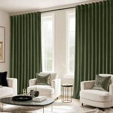
Green: Associated with nature and balance, green works well in living rooms or home offices.
Gray: Neutral and sophisticated, gray offers versatility and complements almost any decor.
Understanding these effects can help you select colors that align with the purpose of each room in your home.
2. How to Choose the Right Shades for Each Room
1). Living Room: Warm and Welcoming
The living room is often the heart of the home, where families gather and guests are entertained. Opt for:
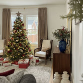
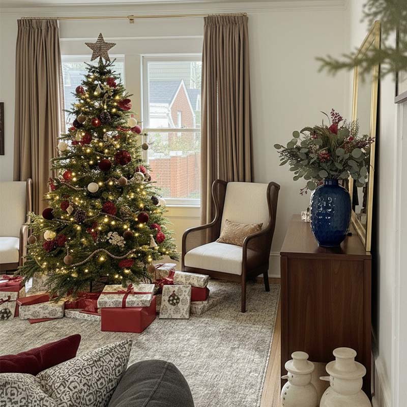
Warm tones like beige, terracotta, or muted yellows to create a cozy, inviting atmosphere.
Accent colors: Pair neutrals with bold cushions or throws in deep greens or blues to add character without overwhelming the space.
2). Bedroom: Peaceful and Restful
Bedrooms are personal sanctuaries, and the colors you choose should promote relaxation. Ideal shades include:
Cool tones like soft blues, lavenders, or pale greens to create a serene environment.
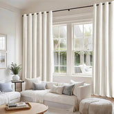
Earthy neutrals like taupe or light gray for a minimalist, calming aesthetic.
3). Kitchen: Bright and Energetic
The kitchen is a space for creativity and socializing. Enhance the mood with:
Sunny yellows or warm oranges to inspire energy and conversation.
Clean whites paired with pops of color like mint green or navy for a modern, fresh vibe.
4). Bathroom: Refreshing and Spa-Like
For a bathroom that feels like a retreat, stick to light, airy colors:
Soft pastels like seafoam green or powder blue evoke a spa-like ambiance.
Monochromatic schemes in white or gray create a clean, timeless look.
5). Home Office: Focus and Productivity
Your home office should inspire focus without feeling sterile. Opt for:
Greens to promote balance and reduce stress.
Blues to enhance concentration and productivity.
Avoid overly stimulating colors like red, which may cause distraction.
3. Trending Colors in 2025
For a modern and stylish home, consider incorporating these trending colors:
Greige: A mix of gray and beige, offering a neutral yet warm foundation.
Sage Green: Perfect for adding a natural, earthy touch.
Burnt Orange: A bold yet sophisticated accent color.
Muted Blues: A timeless choice that pairs well with almost anything.
4. Tips for Combining Colors
Use the 60-30-10 Rule: This classic interior design principle suggests 60% of the room should feature a dominant color (like walls), 30% a secondary color (like furniture), and 10% an accent color (like decor).
Consider Lighting: Natural and artificial light can alter how colors appear. Test paint samples at different times of the day before committing.
Layer Textures: Combine materials like velvet, linen, or wood in your chosen color palette to add depth and richness.


