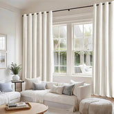
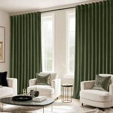
5 Mistakes People Make When Matching Curtains and Pillows.
Mistake #1: Matching Everything Too Perfectly
Matching your curtains and pillow covers like twins might feel like the safe option—but here’s the truth: too much sameness can make a room feel like a hotel suite, not a home.
When every element in a room shares the same exact color, texture, or pattern, it flattens the entire space. What you really want is harmony, not uniformity. A great rule of thumb? Use a main tone, a supporting tone, and one “pop” element that brings the unexpected.
Want an easy way to get started? Try browsing the solid pillow cover collections from Miulee—pick a base color that matches your curtains, then add in one or two accent tones nearby on the color wheel.
Designer Tip: If your curtains are navy, pair them with cream, slate blue, and even a subtle rust tone in your pillows. Let your palette breathe.
Mistake #2: Ignoring Texture Contrast
Not all contrast comes from color. If everything in your room is the same texture—say, smooth cotton or flat linen—your space might still look bland, even if the color palette is solid.
What gives a room depth is how things feel, not just how they look. Mixing textures like velvet, faux fur, woven linen, and slub cotton allows the eye (and hand) to explore.
🧶 Texture Combo Idea: Try pairing a matte linen curtain with velvet pillows, then anchor the look with a neutral cotton throw.
Mistake #3: Not Considering Lighting
Color and texture don’t live in a vacuum—they react to your lighting. What looks like soft sage in the morning could turn grayish green by dusk, especially with artificial lighting.
Before deciding on your pillow-curtain combo, make sure you look at them:
In natural daylight
With your lamps on at night
From different angles across the room
🌞 Pro Tip: If your room gets minimal light, avoid heavy dark colors on both pillows and curtains. Instead, combine a neutral base with medium-tone accents to keep things airy.
Mistake #4: Choosing the Wrong Scale or Size
Let’s say you’ve picked a stunning color combo—maybe blush and ivory with a hint of gold—but if all your pillows are the same size (hello 18x18 overload), your room might still fall flat.
Here’s the thing: scale matters.
Layering different pillow sizes creates visual rhythm. Start with two 22x22 pillows as a base layer, add 20x20 in a contrasting texture or tone, and finish with a lumbar pillow in the center. That’s how designers do it.
You’ll find size ranges from 12x20 to 24x24—and trust me, that variation makes all the difference on a sectional or queen bed.
📏 Layout Recipe:
Bed: 2 euro + 2 square + 1 rectangular
Mistake #5: Forgetting the Room’s Function
Not every pillow belongs in every room. Period.
A pillow combo that’s perfect for lounging in the living room may not make sense in a serene, sleep-focused bedroom. That’s why it’s important to consider how the space is used:
Living Room: You want conversation, color, a little flair
Bedroom: You want comfort, calm tones, and softness
🛏️ Quick Rule:
If you’d describe your pillow combo as “fun,” it probably belongs in the living room. If it’s “soothing,” that’s bedroom material.
Final Tips from Designers
So, what’s the secret sauce?
Designers often use a “3 + 1” method:
3 pillows in a coordinated palette
1 pillow in a bold or unexpected tone/texture
This keeps the whole setup grounded but not boring. The key is intentional contrast.
👀 Starter Set Strategy:
Buy a 2-pack in your curtain’s color family
Add one pattern and one texture contrast
Place, fluff, and admire
Frequently Asked Questions
Q1: Should pillows and curtains be the same exact color?
A: Not exactly! They should coordinate, not match 1:1. Think in tones, not hex codes.
Q2: Can I mix florals with geometrics?
A: Totally. Just keep them in the same color family and mix up the scale (one large, one small).
Q3: How many pillows are too many?
A: On a sofa: 5 max. On a queen bed: 6 max. More than that and it becomes a pillow fort.
Q4: How often should I rotate covers?
A: Seasonally is great. Use lighter colors for spring/summer and rich tones for fall/winter.
Q5: What's a safe style for beginners?
A: Neutral curtains + one pop of texture (like velvet) + one pattern = foolproof combo.


